Analytic Techniques
A Vector GIS Data Model for Access to Trolly Stops
In our previouis tutorials, we have explored the ways that the we can systematically associate features using Structured Query Language (SQL) to explore associations among features within one table, using structured querey language, or across systems of tables, using joins. We have also seen that while classic SQL operates on attributes that are encoded as text, numbers and dates, GIS provides ways to explore spatial associations among features. These associative capabilities are the root of vector-based GIS. The fundamentals are straight-forward and they get much more interesting when you start to look at the ways that data and associatiative operations can be combined together to simulate relationships among tings and conditions that exist, or that we might propose.
Part of the power of information system comes from automating simple procedures to carry out complicated or repetitive tasks, which can be used to explore relationships and to repeat analytical tasks on data-sets that represent existing or alternative future conditions.
This tutorial explores some of the most common patterns used to apply vector GIS techniques to explore geographical questions. Naturally, in an introductory tutorial, we can only scratch the surface. Hopefully you will get a feel for how these functions work. When you see some spatial mechanism in the wild, or encounter data about things and conditions that is stored as rows in tables, you will know where to look for the functions that will help you to turn your conceptual model into a vector-relational data model!
Our example begins with the question: Can we use Census data and GIS to estimate the number of people who are served by various alternate arrangements of proposed trolley stops? Of course the answer is yes! In fact there are many ways of evaluating this that vary in terms of the source of data that we are using and the means of simulating the phenomenon we call accessibility. The more important question is: how can we evaluate our level of confidence in an estimate? These models give us a few new ways of thinking about how to model Spatial Mechanisms and also a few new ways of looking at the relationship between the The Awkward Lumpiness of Data.
Sample Dataset
- Click here to download the zip archive of the sample dataset Open the file Trollypop/Start_Tutorial_Here.mxd.
- Spatial Models for Scholarship and Decistion Support
- Geoprocessing Cheat Sheet
Example Map
Conceptual Model, Decision-Making Scenario and Data Sources
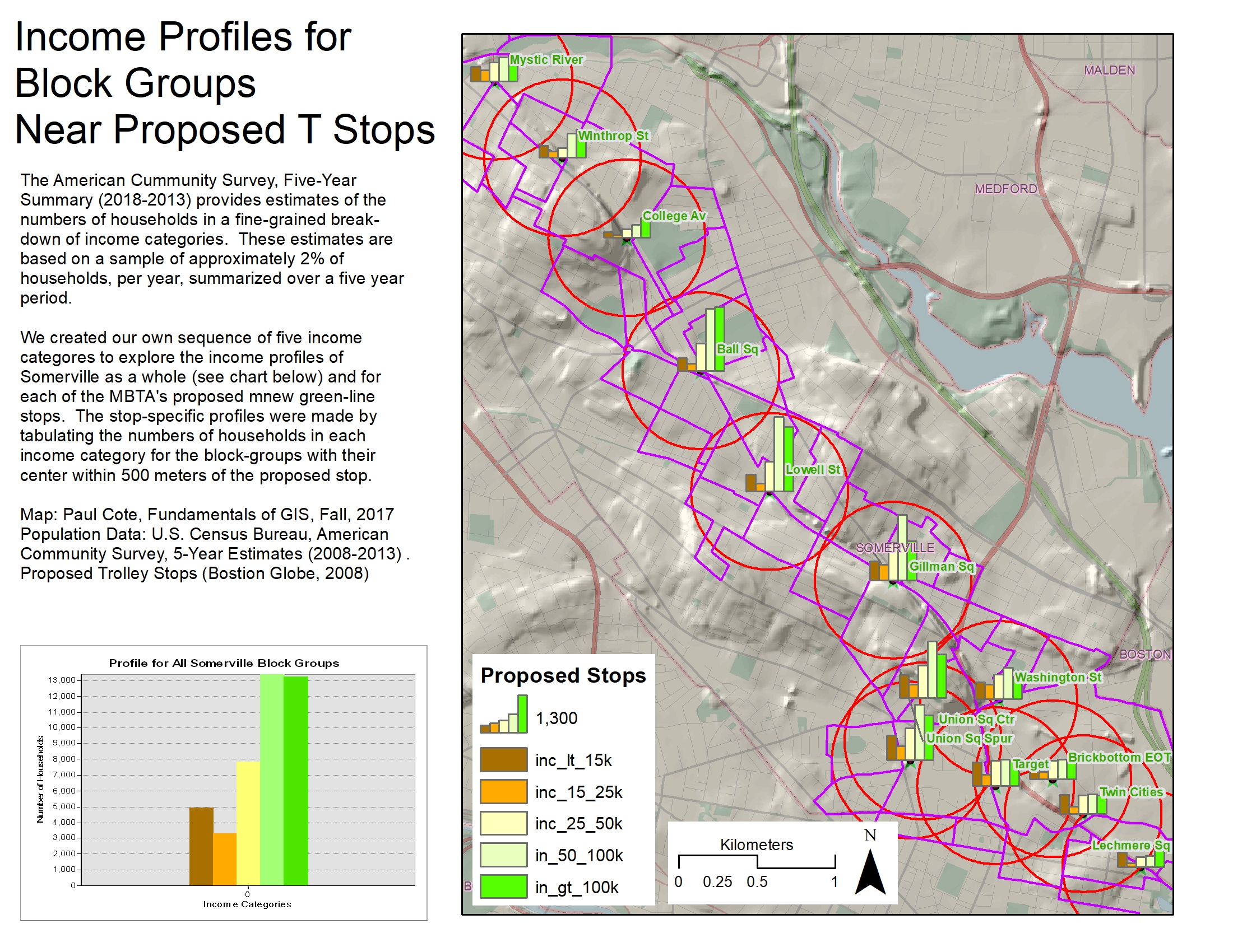
The Massachusetts Bay Transportation Authority (MBTA) is planning an extension of Boston's Green-Line trolley system through the city of SOmerville. At the time this tutorial was developed the MBTA was proposing 9 to build stops. There were two alternatives for Union Square. Alternative 1, The Union Square Spur, would have been a station near the commuter-rail line. The second alternative, Union Square Center would have the trolley turn a corner and come closer to the center of Union Square. At a community meeting in East Cambridge, two additional stops were proposed: The Brickbottom stop, whould serve the Brickbottom lofts condominium complex, and another would service the Target store. The stops proposed by the MBTA were taken deom a map published inthe Boston Globe in February 2008. To these I added the Brickbottom and Target stops. These are represented as points in the shape file TrollyStops_Globe which you can find in the sample data-set.
Deciding where to locate a trolly stop is a complicated issue that involves lots of considerations related to how long it takes trollys to speet up and slow down, and many many more. One facet of the problem to consider is how many people will be served. Even this is complicated, because we don;t know where people wil be living in 20 years when the project is complete. One way to make a model that has some plausible use, might be top consider current residents (as represented by the 2000 census) because these people are consituents and part of the decision-making process. Later on, we may make another model that considers potential new resiential development, commuters and customers of local businesses. For now, we will try to evaluate stops based solely on proximity to residents counted in the 2010 census.
WIth awareness that we are only trying to model a very narrow aspect of the stop location problem, we wil focus the evaluation of our modeling effort on our ability to model population from the 2000 census. We can use the block level data, Blocks2k to represent the a very good estimate of the resident population from the decennial census 100 percent count. We may also be interested in exploring economic justice issues using income data, which are part of the 2000 long-form census, which is extrapolated from a sample size of approximately 6 percent and available at teh muchj coarser block group level of aggregation, in the shapefile, BlockGroup2k. You can find these layers in the Census group layer if the sample ArcMap document. Metadata for these data-sets are provided as blocks2k.txt and blockgroups2k.txt in the Sources/Census folder in the sample dataset.
Consult Prior Work
Following our procedure for developing and evaluating spatial models for decision support we have consulted prior work in this area (Jarett Walker's Transit Blog) and found support for the idea that Americans in good health are generally willing to walk half a kilometer to light rail transit.
Consider the Real-World Spatial Mechanism and Simulation Technique
In an urban area, a 500 meter walk is rarely a straight line. As with most spetial mechanisms in the real-world, there are mediating conditions to be considered, corridors, such as sidewalks and open-space may be more attractive for various reasons, and there may also be impediments, such as busy streets to cross, rivers, and other more or less impassable places.The Buffer function in GIS provides a very simple way of modeling proximity as a simple radial distance from a point. If we use a 500 meter buffer to model walking distance it will almost always over-shoot the an actual 500 meter walking distance walking distance. We also have a more complicated GIS modeling technique that measure distance through a network of roads. As you cansee in the last image of the slide-show below. This network distance wil not be a perfect representation of walking distance either. For one thing, not all roads have sidewalks, and not all intersections are trversable by pedestrians, and so on. Nevertheless, it will be interesting to play with the network distance function and to explore what difference this alternate simulationmethod might make.
Geoprocessing Models, An Experimental Framework
As you can see form the discussions above, there are many questions that we can explore justing the simple combination of a set of facilities and a couple of census layers. Eachof these questions may be repeated to simulate alternate stop layouts under consideration. We slao can repeat experiments using Block level data to measure poulation and block group level data for an explorarion of potential accessibility diffeences for different income groups. Furthermore we can repeat the experiments using different means of simulating accesibility. If we had a framework for chaining together analytical procedures and repeating them, this would save us a lot of work! If were able to build such a framework, we could also apply it to a similar analysis of any other alternative future scheme involvnmg any sort of facility.
As it happens, ArcMap has a very nice interface for creating models that shain tools together. It is called The Geoprocessing / Model Builder Framework
This tutorial will do three things:
- Introduce many of the most common Vector GIS tools in a caaual ad-hoc mode.
- Practice developing and Critiquing Conceptual Models and their implementation as Data Models.
- Practice using the ArcMap Model Builder interface to save chains of procedures as re-usable scripts.
- Introduce the use of ArcMap to make charts.
Ad-Hoc Spatial Selections and Summaries
There are two modes of using GIS: When a person is just curiously poking around she is in ad-hoc mode. Pulling down menus and selecting, right-clicking and filling out forms... It is OK when you are just trying things. As we will see, the act of trying to estimate how many people live near a trolly stop, it takes about 15 steps of choosing things and filling in blanks. And then if we want to see how many people live within 750 meters, all of those steps have to be repeated. At this point, the ad-hoc method loses its luster. Thankfully, there is a way of combining tools into re-useable models which we will see in a moment. But before we move on to this more advanced mode of analysis, lets start with the casual-ad-hoc method.
Our method is going to have three steps. First, we will explore our source data: Trolley Stops and Block Groups. Then we use the Buffer tool to create a new polygon that represents the area within 500 meters of a trolley stop. Then the Select by Location tool to select the block groups that vall witin the buffer. As we will see, there are many ways of doing this. With the selected block groups we can use the Statistics function to get a sum of the total population in the selected block groups. Finally, we choose to select the block groups that have their center within the buffer. Finally, we can aave the selected block groups to a new layer so that we can control their appearance for a map.
Explore the Source Data
- Inspect the Attribute table of the layer Trolly_Stops_Globe each trolly stop is represented by a point. These are proposed stops. Some of them represent alternative locations. Not all of them will be built. There is a name attribute for each stop.
- Inspect the attribute table for the BlockGroup2K shape file that you wil find in the Census Group Layer. The field named
P01001 represents an estimate of the number of residents in each block group according the the 2000 census.
Explore Geoprocessing Tools
In ArcMap, the act of fiddling around with tools is called GeoProcessing. And there is a huge collection of tools that do lots of amazing things. Some commonly used tools can be found by pulling down the Geoprocessing Menu. Others are available in under the Selection Menu. These are good to know about for ad-hoc exploring. The same tools and many more are available in the Geoprocessing Toolbox, which can be opened by clicking on the little red toolbox icon on the standard ArcMap toolbar.
The toolbox is organized by a hierarchal nest of toolboxes and tool-sets. So any tool can be referenced by its path in the toolbox hierarchy. For example, the Buffer tool can be found within the Analysis toolbox, inside the Proximity tool-set. So, I can tel lyou how to find the tool by giving you the path: Analysis Tools / Proximity / Buffer. Exploring the toolbox is a good idea. You can brows through it. Or you can search for tools by pulling down the Geoprocessing menu and choosing Search for Tools.
If you open the Buffer tool you will see that it has a form with many blanks to fill out. There is a Show Help button on the lower right. Click Show help to expose the help panel. Now, if you click in any of the Form fields, a short explanation shows up. If you want more information about the tool, you can click the Tool Help button. With many tools, the most useful help page is the one that says Learn more about how this tool works at the top of the first help page.
Buffer the Proposed Trolley Stops
A buffer is a very simple model for spatial association. It takes any vector feature and creates a zone around it that extends radially from each point, line or edge. In a sense this is a type of transformation. There are lots of options.
References
Buffer your proposed T Stops
- Find the Geoprocessing Menu in the ArcMap menu bar. Pull it down and choose Buffer .
- Drag your Trollystops_Globe layer form the table of contents into the Input Features blank.
- Check that the Output Features blank is placing the output in a place within your project that you wil be able to find again. It is good to have a scratch folder to put stuff when you are just fooling around, rather than cluttering up your data folder.
- For Linear Units enter 500 Meters.
- Finally, choose Dissolve All from the Dissolve Type pull-down.
- Click OK, and wait patiently for your buffer to be added to the map.
Inspect your new Buffer layer. It has just one polygon because we chose the Dissolve All option. If we had left it at the default, Dissolve None, there would be a separate buffer polygon for each trolley stop.
Select the Block Groups in the Buffer
Next we are going to apply the Select By Location tool to select the census block groups features that are intersected by our buffers.
References
Select 2010 Census Blocks Near Trolley Stops
- Find the Select by Location Tool you can find it in the Selection Menu on the main ArcMap toolbar.
- In the Target Layers panel, check the box next to your 2010 Census Blocks layer.
- In the Source Layer field, choose your new buffer layer.
- Leave the Spatial Selection Method set on Intersects for now.
- Then click Apply
- Inspect the Block Groups layer in the map window. See the blue polygons have been selected that intersect with the buffer. Many of them are being selected that only touch a corner. Clearly this is going to be an over-estimation of the block group population that are within 500 meters.
- Pull down the Spatial Selection Type menu and all the way at the bottom, find the option for Have their centroid in the source layer. Then click apply.
- Now inspect the selection again. Clearly the chunkiness of the block groups is makes it impossible to do this perfectly.
Counting the Sum of the Population for the Selected Block Groups
Soon we will have an answer for how many residents were estimated in the 2000 census to be living in block groups that have their centroid inside of a 500 meter buffer around proposed trolley stops. Notice how I am being very precise in my language. I could have said that we are going to know "how many people live within walking distance of the stops." But of course, intelligent people reading this would then see that I really don;t understand what I am talking about! In any case, here is how you can quickly get a summary of statistics for the selected rows of a table:
References
Examine the Sum of Population for Selected Block Groups
- Open the Attribute Table for your Blockgroup2k layer.
- Note at the bottom of the table viewer that there are soveral block groups selected.
- If you want to view selected records, you can click the View Only Selected Records button at the bottom of the table. remember that if you leave the table set this way, if you later unselect the rows, the table may appear empty until you change the setting back to
View all Records ! - Now right-click the field, Pop10 (estimated population) and choose Statistics. Many statistics are shown, including Sum which is the sum of the values from the Pop10 field for the selected rows!

Saving the Selected Block Groups to a New Layer
Ultimately we are going to make a map to illustrate our finding. We want to control the graphical hierarcy of the map to show population density for all block groups, and the buffer that represents our notion of "Within 500 Meters" and we also want to have a special outline around the block groups that are selected. Between now and the time we make our map, we may select other things or just clear our selection. So right now, while we have this special set of block groups selected, lets save it to a new layer and give the new layer a meaningful name.
References
Make a Selection Layer
- Right-Click your 2010 Census Blocks layer, and choose Selection > Create Layer for Selected Features
- A new layer is created at the top of your table of contents. Change its name to something meaningful.
- Now you can use the selection menu in the main arcmap toolbar to choose Selection > Clear Selected Features. And now you stil have a layer for your subject block groups.
- Adjust the symbology of these block groups so that they have no fill and a boundary color that makes them stand out above the other block groups.
Thoughts about Ad-Hoc Geoprocessing
Up until now, our relationship with AcrMap has consisted of interacting step-by-step.
Its good to have a quick informal way of exploring relationships among features and layers in ArcMap. But as you can see, it ivolves a lot of clicking and right-clicking and filling in forms that is easy to do, and yet will become very tedious if we want to explore different options, such as different buffer sizes or different combinations of T stops. Luckily, the geoprocessing framework has some modeling tools that allow us to save the chains of steps that we have taken. Once these are saved as Models we can go in and change things, like which stops we can easily make small changes to one thing or another, and quickly repeat the analysis.
Creating Repeatable Models with the Geoprocessing Framework
It is usually the case that if you do something interesting with ArcMap, you are probably going to want to try it again. And if you do something complicated, you are likely to make a mistake but you may not notice until you have finished, and then it is very hard to tell what you did wrong. The Geoprocessing framework in ArcMap provides a way for you to build repeatable re-suasbele, self documenting models. These models make your work easier, and allow you to share complex procedures with other people. Reusable models also make it much easier to teach and learn GIS!
Get started with the Geoprocessing Framework.
This is one of the tutorials in our intro to GIS sequence that incorporates the ArcMap geoprocessing toolbox. THis toolbox includes hundereds of tools. All tools share common patterns in the way that you find them, how you figure out what they are supposed to do, how you use them, and how you then figure out why the did not seem to do what you expected. Because I have a few tutorials that call on the same basic introduction to geoprocessing, I have put this into its own tutorial which is Required Reading.
References
Setting up Your Geoprocessing Options and Environment
The following steps are outlined in detail in the Geoprocessing Cheat Sheet.
- Note that there are many links on this page to deeper documentation on geoprocessing tools and the model-builder interface. At some point you may want to look at these.
- Read the steps listed under Setting Up your Modeling Laboratory and Setting your Geoprocessing Options and Environment
- Go to the ArcMap Geoprocessing menu and choose environments. Notice that the folloowing environment variables have been set in this trollypop project:
- Workspace and Scratch Folders
- Processing Extent
- Output Coordinates
Note that in when you make your own projects, you wil have to set these geoprocessing settings and environment variables yourself.
Creating a Toolbox
The way we save and share our geoprocessing scripts is in a file known as an ArcGIS Toolbox. This is a prioprietary file that works only with ArcGIS.
Create your First Toolbox
- Take a look in trollypop/projects/pbcote/tools you will see a few of these toolbox files. One of them is named, pbcVectorDemo.tbx..
- Click the Show Toolbox button
 to expose the ArcMap toolbox panel.
- Right-Click in an empty place in the toolbox panel and choose Add Toolbox. A file explorer dialog pops up.
- Find your way into trollypop/projects/yourname/tools
- Click the New Toolbox button.
 .
.
- A new toolbox appears!
- Select the toolbox aand clock Open.
- The new toolbox is added to your tools panel in AcrMap.
- YOu can rename it MyFirstToolbox.
- Now go back to your Geoprocessing > Environments and change your Workspace and Scratch folders to reference the scratch folder that is in the same project folder with your new toolbox.
Creating a Workflow to Model "Near Trolley Stops"
We will begin by using geoprocessing tools to repeat the same steps that we went through at the beginning of this tutorial. Only this time we will find the Buffer and select tools in the geoprocessing toolbox. We will make our model repeatable by dragging tools and data into a a new geoprocessing model and connecting them together. When we are finished, we will save the model so that we can re-use it and create new versions of it to do different things. With this model, we wil introduce a few very commonly used tools in the geoprocessing
References
Make a Simple Model for Buffering
- Create a new model in your toolbox.
- Search for the Buffer tool, ie find it in the Analysis / Proximity toolbox and drag it into your model canvas.
- Add your trolley stops layer and a buffer tool to your model.
- Use the Connector Tool in the model window to connect your Trolley Stops layer as the input features for your buffer operation.
- Double-click the Buffer operation and fill in the rest of the parameters. Especially make sure to set the Dissolve parameter to All
- Run your Buffer Operation, by right-clicking on its yellow box and Choosing Run.
- Right-click the green oval for your buffer output to add it to the display.
Associating BlockGroups with The Near Trolley Stops Buffer
Now we will add another dataset and operation to our model workflow to select census geometries that are considered to be "Near" the proposed trolley stops. We will see that there are many ways of specifying this association. The fundamental tool here will be the Select Features by Location tool. We will alter our model to select the appropriate blockgroups and then to summarize the population considered near. We will think about the problems of over or under-estimation of the served population when we use blockgroups as our representation of Residents Served.
References
Finding Census Blocks Near Trolley Stops
- Right-Click your Open your new model and choose 'Edit' to open the model for editing.
- Find the Select Layer by Location tool and drag it into your model. Hint: you can find this tool in the Data Management Tools / Layers and Table Views toolbox.
- Drag your 2010 Census Blocks layer into the model.
- Set up this procedure so that 2010 Census Blocks is the Input Layer and the Buffer is the Select Layer.
- Inside the Select Layer By Location procedure (yellow box) observe the options for Overlap Type Leave it set to Intersect for now.
- Run the procedure and observe the results. You may need to Refresh the display using the little circular arrows button at the bottom left corner of your map window.
- Take a look at the selected block Groups and assess whether you think that this is an overestimate or an underestimate of the population well served by the new transit stops.
- Open the attribute table and Calculate Statistics for the column, Pop10 which is the 100 percent count of population form the short-form decennial census questionaire.
- If this experiment was being documented for research, you might capture a screen-shot of the resulting selected set of blockgroups and the chart of statistics.
- Repeat the previous 4 steps using different parameters for Overlap Type. Which one is best?
I think that the overlap type setting, Has Centroid Within is probably the best compromise among all of the overlap types that are too-encompassing, or the too restrictive. So lets make a note of the estimated total population. Do you think it is an overestimate or an underestimate?
Cause your Model to Save Selected Block Groups as Persistent Layers
Part of our goal inperforming this analysis will be to communicate our findings and our methodology in a easy-to-understand map. See Example. As we saw in our ad-hoc example, above, it is useful to make the selected block groups as their own layer so that this set of blocks will persist after we have selected something else. Saving this set of blocks to its own layer will also give us control over the symbolization of the block groups that are near trolly stops. To accomplish this, we will find the Make Feature Layer tool in the Data Management Tools / Layers and Table Views toolbox.
Refrences
Saving model results as a new layer
- find the Make Feature Layer tool in the Data Management Tools / Layers and Table Views toolbox. Drag it into your model.
- The green oval that is the output of the Select By Location>/b> procedure in the previous step represents blocks that have their centroid in the "near trolly stops" buffer. Use the connect tool to drag a to the yellow Make Feature Layer box. You wil be offered a choice to use the selected blocks as the Input Features choose this option (it happens tobe theonly option for this tool!)
- Double-Click on the Make Feature Layer tool to expose all of its parameters.
- The only parameter we need to set inthis procedure is the name of the new layer that we want to create. Lets call this one MBTA Scheme Blocks. Click OK to close the Make Layer tool.
- Save your model.
- Now right-click on your new Make Feature Layer procedure and choose Run.
- Right-click on the green oval that represents your new layer and choose Add to Display
- Notice that you have a new layer in your table of contents. Check out its attribute table. Notice that it is a subset of the blocks in the region, filtered according to oue spatial query.
- From the arcmap Selection menu, choose Clear Selected Features. Notice that the bright blue outliens dissappear, but we stil have our filtered set of blocks!
- You can change the symbology of this layer to turn off the fill and make the block boundaries green or whatever you want.
The new feature layer we created ion the preceding steps is known as a View in the language of relational database management systems. The view is not a new file, it is is a filtered view of its parent table or feature class, which exists in the computer's memory and is re-generated when we open the ArcMap document or run this model.
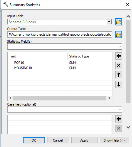
Use a Summary Procedure to Calculate the Sum of Population and Housing Units
When we were doing this analysis using the ad-hoc mode of analysis, we made a summary of the population of the blocks that wer found to be witin a distance of the trolly stops, by opening the attribute table for our selectd blocks layer and right-cliking on a column. There we used the Statistics tool to pop up a quick summary of the values in the table. This is fine when we are just fooling around, but the results dissapear when you close the pop-up.
A useful aspect of building models is that we can make results persistent, so that we can refer to them later. This is the next function we will add to our model. We wil use the Summary Statistics too, which can be found in the Analysis > Statistics toolbox.
References
Create a Summary Table for your Selected Blocks
- Find the Summary Statistics tool in the Analysis > Statistics toolbox.
- Connect your new Blocks layer to it as the Input Features
- The Summary Statistcs function does not turn yellow, because there are still parameters that need to be filled out. So Double-Click onthe Summary Statistics box to expose ite parameters.
- We want to create two sums. One for the values inthe Pop10 column, and another for the Housing10 column.
- From the Statistics Fields column, choose Pop10 notice thatthis column appears in the list of colums below. But there is still a red X next to the Statistics Fields pulldown. You canhover over the red X totry t figure out what the problem is. Unfortunately this warning is not much help!
- Click your mouse in the empty space to the right of the entry for Pop10 a deopdown menu will emerge take a look at all of the summary statistics you could calculate. Choose Sum.
- Your Summary Statistics dialog should look like this screenshot.
- Name the Output Table fo rthis procedureMBTA_Blocks_Summary.dbf
- Now you can run your Summary Statistics tool. When it finishes, right-click on its output (green oval) and choose Add to Display
- You will see that your ArcMap table of contents shifts to List by Location mode, and your table, shold appear. Right-click on it and choose Open to see the results.
Thoughts about Scripting versus Ad-Hoc Analysis
One of the great things about the Model Builder interface in ArcMap is that models are self-documenting. Most GIS analyses involve sequences of procedures that transform input data-sets according to user-supplied parameters. The output of one procedure is the input for another. Geoprocessing models provide a means of setting and saving the parameters and sequences. The resulting models contain everything that one needs to know about how each data-set was transformed. This provides a very concise way of sharing know-how with collaborators. People who understand how to look inside these models can figure out exactly how they work, and can tailor them to their own purposes.
This process may involve making a copy of a model, studying the way it works by looking at the data inputs, looking at the help for each procedure (yellow box), right-clicking the procedure and running it, and examining the result. One steps through the model this way, and develops an appreciation for how the model works. Once the model is understood, a toolbox and its models can be copied toother projects, and connected to other data-sources.
As an instructor, this system for encoding process knowledge is liberating because it means that I don;t have to include exhaustive screen-shots to my documentation any more!
A Tour of the Models in the pbc_Vector_Demo Toolbox
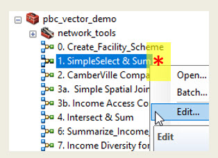
The next few sections of this tutorial will explore common vector GIS patterns by looking through some of the models in the pbc_vector_demo toolbox. A few of these tools are described below. Each of these tools should run from my toolbox. You can read the overview, below, then open the tool for editing and examine the data inputs and procedures. Run each procedure individually, and examine the results. Once you understand how the model works, you can copy it to your own toolbox and modify it to suit your own purposes. Notice form the image at the right, that to open a model for editing, you right-click on it and choose Edit.
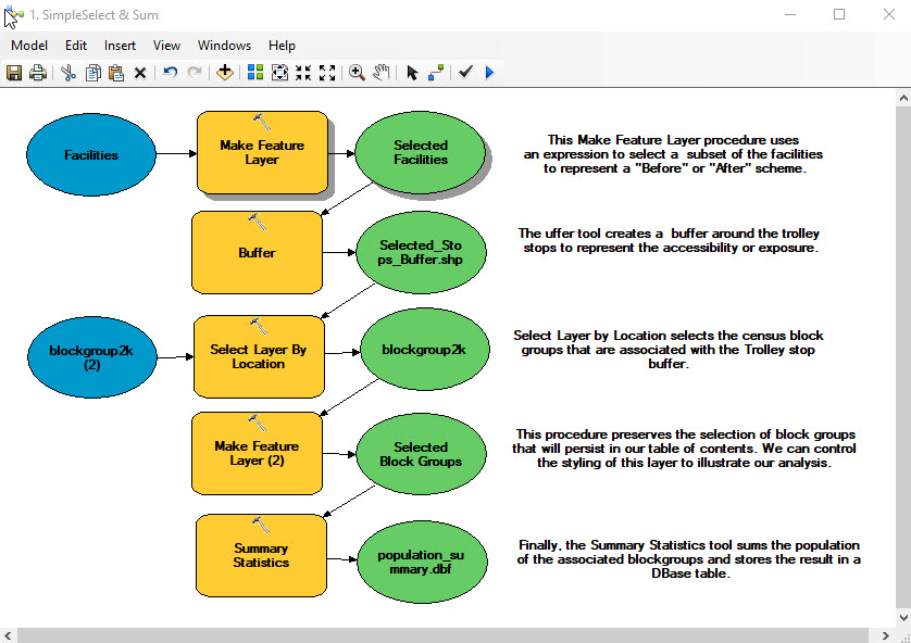
The Simple Select and Sum Model
This model is very similar to the one we created earlier in this tutorial. The model includes Make Feature Layer tool at the beginning, and sets a Query Experession so that the new layer contains just the stops that were originally proposed by the MBTA. The selected stops represent a scheme that is are saved to a new layer that will persist in the ArcMap table of contents. The model then creates a buffer polygon around our trolly stops scheme and selects the census areal units that are associated with the stops. FInally, the Select and Sum model uses the Summary Statistics tool which calculates the sum of the population within the selected block-groups and saves the result in a D-Base table.
Comparing Alternative Futures with the Select and Sum Model
The heart of the Select and Sum model is the table of facilities that includes a representation of a primary scheme of facilities with alternates. The tutorial Creating an Experiomental Scheme explains how to create your own scheme table that could involve points, such as businesses or farmers markets, health centers, firestations or libraries. Or your scheme table could include polygons like parks, or lines that might represent links in a metwork of bicycle trails.
SQL Queries for Selecting Schemes
There are a couple of tricks worth sharing about how to create SQL expressions that select schemes within the first Create Feature Layer procedure in the select and sum model. Our example uses a simple SQL expression to select all of the MBTA Proposed stops and add the alternative stop named "Union Square Ctr", as pictured below.
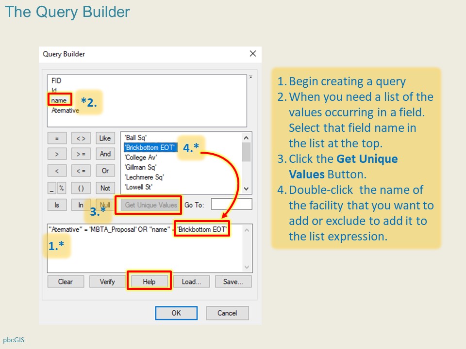
These queries can get complicated when schemes involve supressing and activating several facilities. If there is just one or two facilities to activate and to supress you could use an Or operators like so:
("Alternative" = 'MBTA_Proposal') or ("Name" = 'Brickbottom EOT')
It can be helpful to use parentheses, as in the example above, and to look at the expression in the first pair of parens as building a set. The expression in the second set of parentheses is a set that includes one stop. The Or operator extends the first set with the second one.
The creation of SQL expressions is a very deep subject. It takes a lot of fooling around to see how these work. There are many useful examples provided in the page that pops up when you click the Help button at the bottom of the Query Builder window.
The layer that results from the this query expression includes all of the MBTA's proposed scheme of stops and also adds the feature record for the stop that has the name "Brickbottom EOT". This layer is added to the display as Scheme B Stops. This layer also affects subsequent buffers, selecion of clocis and the and summary. Notice that the names of all of the resulting layers and tables in this model are set up to create new layers whose names begin with Scheme B
Using the Simple Select and Sum Model to Experiment With Alternative Future Scenarios
Once we have this model set up to create new layers for Scheme B (the Brickbottom Stop Scenario), we can easily change the query expression in the first Make Feature Layer as shown below:
"Alternative" = 'MBTA_Proposal'
If you need to exclude a specific feature or set of features you can use the Not Equald Operator or "><" symbol on your query builder keypad. The Unique Feature ID column is a uesul way to reference any row in the table, like so:
("Alternative" = 'MBTA_Proposal' AND "Name" <> 'Union Sq Spur') OR "(Name" = "Union_Sq_Center")
The query above identifies a scheme of stops that includes all of the MBTA proposed stips except for the Union Square Spur. Then it adds the stop called Union Square Center to the scheme. Note the parentheses are helpful for readability, and in some cases they are necessary, but you need to be careful to keep them symtrically matched.
99 percent of errors with SQL expressions come from mis-matched parenthesises, or using the wrong sort of quotatioon marks.
The unique feature ID is a required field in relational tables. In a shapefile, this filed is named FID. It is a convenient way to positively identify any feature. You can use this in the query above, just like we used the reference to the "Name" column.
If you have a list of values that you want to exclude or include you couild use the list operator ot IN as shown below.
"Alternative" = 'MBTA_Proposal' AND "FID" NOT IN (10,11,12)
Once we have set up the feature-layer query so that it works, we can choose a meaningful name for the layerthis layer that itsentifies its scheme i.e. MBTA Proposed Stops. Then we can change the names of the oputputs for the subsequent buffer and select and summary functions to reflect this MBTA Proposed scheme. We run the model again and we wil then have the raw material for understanding the total population and housing figures for the scheme that includes the Brickbottom stop and the scheme that does not.
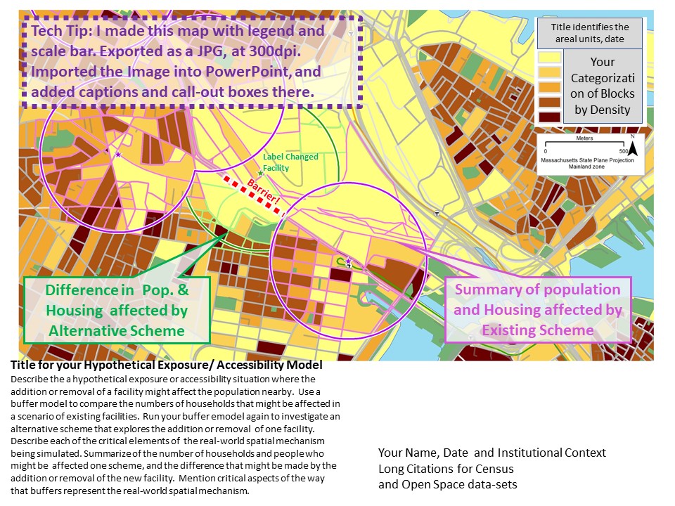
We can then adjust the layer order and symbology to make a map that looks like the example below.
Restricting your Processing Extent
In our example, the estimates of population affected in the MBTA proposal includes the blocks all the way up the extnetion to Medford. It may be easier to describe if the model considered just the proposed stops in the neighborhood of our proposed change. You already know a couple of ways to restrict the set of stops to be considered: You could create a new shape file, by zooming to the extent of your study area and exporting just the stops within the view extent. But this is a lot of trouble and creates a lot of extra data if you shift your display around. YOu also could use the select tool and select just the neighborhood stops before runing the moded. Or make a rectangle representing your study area and using a Select By Location query to make this selection.
But the easy way to control the processing extent of your model is to use the Processing Extent environment setting. While a tool, like the Buffer procedure shows you the set of parameters, like Buffer Distance, there are dozens of other parameters that you could set for any tool. Like what coordinate system you want thr output to be, or what the procesing extent is. Earlier in this tutorial, we discussed how to use the Environment Settings of the map document to set defaults for these. But it can also be useful to set these for specific procedures. The slided below explain how we can use this to set the processing extent for the buffer tool in our SImple Select and Sum model.
Refeences
There are other ways to use variables to call attentions to important parameters in your model. You can slso use substitution variables to do things like change the name of the scenario in all of the model's procedures, withut tweaking each one. We may cover this in class.
Make it Your Own!
Welcome to the exiting world of experimental models with GIS. Now you should know enough to make a versionof my Select andSum model and use it to evaluate your own versions of alternative schemes. To start with, you could use the table of Laundromats in the Businesses group layer. Just drag the Laundromats layer nito the model, and connect it to the first Make Feature Layer procedure (replacing the existing blue oval, named Facilities.)
You will have to explore the Laundromats layer onthe map, and also through its attribute table to figure out how to set up the Query Expression in the first Make Feature Layer procedure to filter the laundromatts layer to create two different schemes.
This procedure will also work with polygons, like parks. There are many layers at MassGIS that cold be the start of your initial scheme.
For a more in depth tutorial about crating experimental schemes, including ones that investigate the addition of new facilities, you can checkout this supplemental tutorial, Creating Experimantal Schemes.The Camberville Comparator Model
The simple Select and Sum model is useful for simulating accessibility around selected points. But if we want to do something like investigate the impact of a new facility to be added to an area that is already partially served by existing facilities, we need a more complicated model. The CamberVille Comparison model demonstrates some of the features we can use for such a study.
- The model begins by creating a universe of census areas: all of the block groups in having their center within the City of Somerville. This selection is saved to a new layer so that we can easily make sub-selection from it. We can also use this table to get the total (2000 Census) population for these block groups -- which would be useful for calculating percents. Normalizing this way will allow us to make a more meaningful comparison with Cambridge later.
- Notice that I am using the Census 2000 Block Groups in this model. You might want to use Blocks, or some more up-to-date census data. In fact, it would be interesting to try both and to compare the results.
- At the top-right corner of the model, we make a new layer of Dog Grooming shops from the ESRI Business Analyst dataset. This selection is made using the SIC code. You can discover what SIC codes apply to different5 sorts of businesses by looking through the attribute table for esri_business_analyst_2010 or ues this on-line SIC look-up tool. A new feature layer is created from these points.
- A buffer is created around the facilities of interest to simulate walking distance.
- In the center of the model, the Select by Location tool is used to select the census areas that have their centers in the facility buffers.
- The model proceeds to create a new map layer of the Somerville block-groups that have their centers within the 500 m buffer. This layer is handy for mapping since we can eliminate the fill, and hightlight the boundaries so that our map wil do a good job of communicating the area that yields our setimates of "population served."
- FInally the model uses the Summary Statistics tool to tabulate the sum of the total population (2010 Census) for these block groups.
This is a fairly elaborate model. Once you sep through it and see how it works. you can change the eSQL expression at the first step to repeat the same analysis for Cambridge. This wil let you answer the question: What percent of Cambridge Vs. Somerville Residents live within walking sidtance of a Dog Grooming Shop? You could fool around with the select queries to investigate how theswe numbers would change if an existing dog grooming shop was closed, or if a new one was created in a strategic place.
Model 3a. A Simple Spatial Join
A review of vector GIS procedures must cover the simple and very useful spatial join procedure.. An ordinary relational join pairs rows in a target table with rows from a join table according to a one-to-one correspndence of values in a key field that is common to both tables. A spatial join matches rows using the spatial correspondence of shapes(points, lines and polygons) associated with each row. An example of a spatial join is provided in model 3a. Simple Spatial Join.Most of the proposed trolly stops are in Somerville, but some are in Cambridge and others are in the city of Medford. Which ones? The simple spatial join, (also known as a Point-in-Polygon join) visits each trilley stop, asks which town polygon it is in, and then joins the attribute values from that town to the stop in question.
Point-in-polygon joins come in handy in many situations. It is convenient that the relationship of a point to a set of non-overlapping polygons is always one-to-one. That is, a point is always in only one polygon. If polygons, may potentially overlap, then the product of a spatial join is unpredictable, in terms of which attributes would show up in the result. This is similar to an ordinary table join in a case where the key values in the join table are not unique.
The ArcMap spatial Join tool has options to deal with situations where relationships are not necessarily one-to-one. For example, where a feature in the target table is associated with more than one feature in the join table, the numeric attributes can be summed or averaged, or the join function could report the minimum or maximum values (or all of the above). AN example of this is demonstrated in Model 7.Create Income Cats: Scripting Tedious Table Transformations
You may recall from our Census Mapping tutorial, that making use of the American Community Survey (ACS), involves a lot of complicated manipulations of table views and joins. For example, the ACS data about income divides the estimated population of each census area into over 25 income categories. If you wanted to explore the impact of removing a facility on a specific income-class, you would want to start by creating a simpler scheme of income categories. This can be donm by adding fields to the ACS Income table for your aggregated income categories, and then summing the apprpriate counts from the fine-grained categories to your higher-order ones. This process incolves a lot of steps. And the trouble multiplies because the first few times that you do it, you will probably find that your new classes do not represent the meaningful income categories. So you will have to repeat the process. The model Summarize Income Cats demonstrates how this is done.
You can use your income categories to explore the income diversity of each block group by creating a bar-chart map!
You also can use ArcMap's Graph-Making capabilities to compare the aggregate income profile for all Somerville Block-Groups that are near proposed trolly-stops, and another for those block groups that are not. You can add and remove stops to see if you can make the system more biased toone end of the income profile or the other.
A One-to-Many Spatial Join
We have already discussed the similarity between the Select by Location tool and an old fashioned table join. Select by location only selects geometries, it does not add new columns to the target table the way that a classic Join does. As we get near the end of our discussion of vector-relational GIS patterns, it is time to throw in a shout out for The Spatial Join. The Income Diversity model near the bottom of our pbc Vector Demo toolbox demonstrates how a spatial join can be used to sum the block group income category data for each of the proposed trolly stops, by summing the block groups near-by for each of the stops. This is actually quite complicated if you think about it. A single block group may be counted in the profile of more than one facility.
Overlay Analysis and Aerial Apportionment of Statistics
An approach that is sometimes applied when our aerial units are chunkier than we would want, is to cut the polygons that carry our statistic, with the polygons for which we would like an estimate. In our case, we could cut our blockgroups with the buffers. Then there are a number of ways that the population for each blockgroup could be apportioned to the remaining pieces. The simplest would be to simply apportion the population to the pieces according to area. Under what assumptions would this yield a true estimate? There are more complicated ways of doing this, for example if we had another layer, like land use that may give us a better picture od which parts of the blockgroups were uninhabited, or which parts may be higher density. These sorts of approaches sometimes lead to logical problems, where for example, the land use data may show an entire blockgroup as uninhabited, and yet the blockgroup seems to have a population!
Take a look at the Intersect and Sum model in the trollypop toolbox. We know that the reflection of population accessibility yielded by thus method will be less precise than the estimate that we obtained using census blocks. One might ask why wwe would even bother to try this model considering that we have block level data. A good reason for doing this is to demonstrate the concept of Sensitivity Analysis. A sensitivity analysis is a neat analytical trick that can answer the question: what difference does it make if we have good vs not-as-good data>. There may be occaisions where the population counts (or sub-counts, such as people living below poverty, are not available at the block level. By looking at the error we have in estimating population with blocks, can give us an idea of how bad our estimates might be in other situations.
Part 2: Calculating Accessibility through a Network
In most of the accessibility models we explored in part 1 of this tutorial, we have been simulating a conceptual model defined in these terms: A transit patron is willing to walk 500 meters to a light rail stop." We have simulated this association using a radial buffer of 500 meters. But, as we have discussed, this is not a perfect simulation of walking distance since people must travel along sidewalks. We could go even further in our understanding of this simulation challenge by reflecting that the 500 meter buffer will almost always result in an over-estimate of areas that are within an actual 500 meter walking distance if the network is concerned. So this next demonstration will demonstrate a more elaborate way of simulating walking distance using a network analysis.
The demonstration described here uses the NetworkTools tool-set that is in the pbcVectorDemo toolbox. The network tools use several functions the ArcGIS Nework Analysis Tools toolbox. Depending on your ArcMap installation, you may have to find that toolbox in c:\Program Files X86\ArcGIS\10.5\Toolboxes.
Some of the functions described below are included in the pbc_Vector_Demo/Prep Network model
references
- Using the Catalog Window
- What is Network Analyst
- A quick tour of Network Analyst
- ESRI Network Analyst Tutorial
- Examine the attribute table of your your MassGIS Roads layer
- Fix the topology of the roads layer with the Feature to Line tool use a tolerance of 2 meters to make sure that all lines have endpoints wherever they intersect another line.
- Create a new attribute named length on your roads table and calculate its length in meters using the Calculate Geometry . This is also handled by the PrepNetework model
- Use Customize > Extensions to activate the Network Analyst Extension.
- Use the Catalog Windowto find the EOTRoads_FeaturetoLine shape file.
- Right-Click the aforementioned layer and choose New Network Dataset You will basically answer no to all of the questions, but in the dialog where it asks you to specify an attribute, add an attribute nmeed "length" and set its property to be Cost, in Meters
- then click your way out of the New Network Datasset tool. When it asks if you want to build the network and add it to the display, say yes.
- Take a look in the SolveServiceAreas model. Read the comments, and open the yellow boxes. IN this model you can replace libraries with your own points layer.
- Run each procedure (yellow box) individually. The Solve tool will create a new Service Areas layer and add it to your table of contents.
- If you want to change the cut-off distances for your service areas, you can do this with the Make Sevice Area
Inspect the attribute table of your new Service Area Polygons. These can be used instead of buffers in any of the buffer-oriented models we have made. If you want to get cancey, note that there are many attributes in the EOT Roads layer including information about the sidewalks on the left and right. YOu might be able this to make a selection of roads in the PrepNetwork tool. You may also find clever ways to adjust the travel costs of roads based on the speed limit attribute.
